Have you ever watched a movie or TV show and seen something you *really* wanted, like a T-shirt an actress was wearing or a beautiful rug from a home renovation show? Now, let's say you search everywhere and just cannot find it… Well, that's where Voxi comes in.
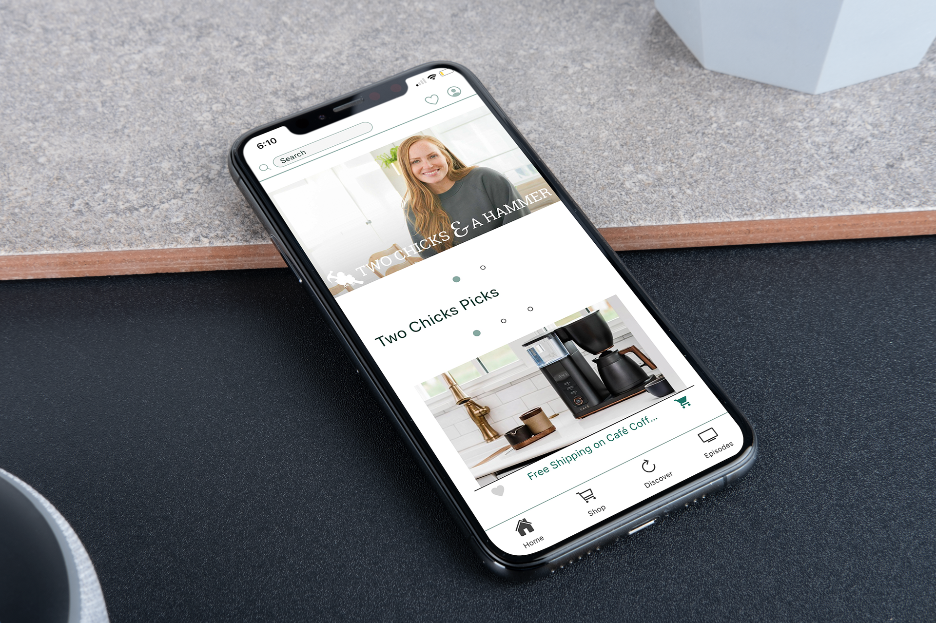
Two Chicks and a Hammer (a brand from the HGTV show 'Good Bones') was one of Voxi's clients. They focus on renovating homes in Fountain Square, Bates-Hendricks, and the surrounding areas in Indianapolis. Our app helps viewers find all of Two Chicks and a Hammer's products and brands (furniture appliances, paint, colors, tools, etc.) featured in their episode in our one easy-to-use mobile app!
My Role: Lead UX/UI Designer
Team Size: 5-10 people
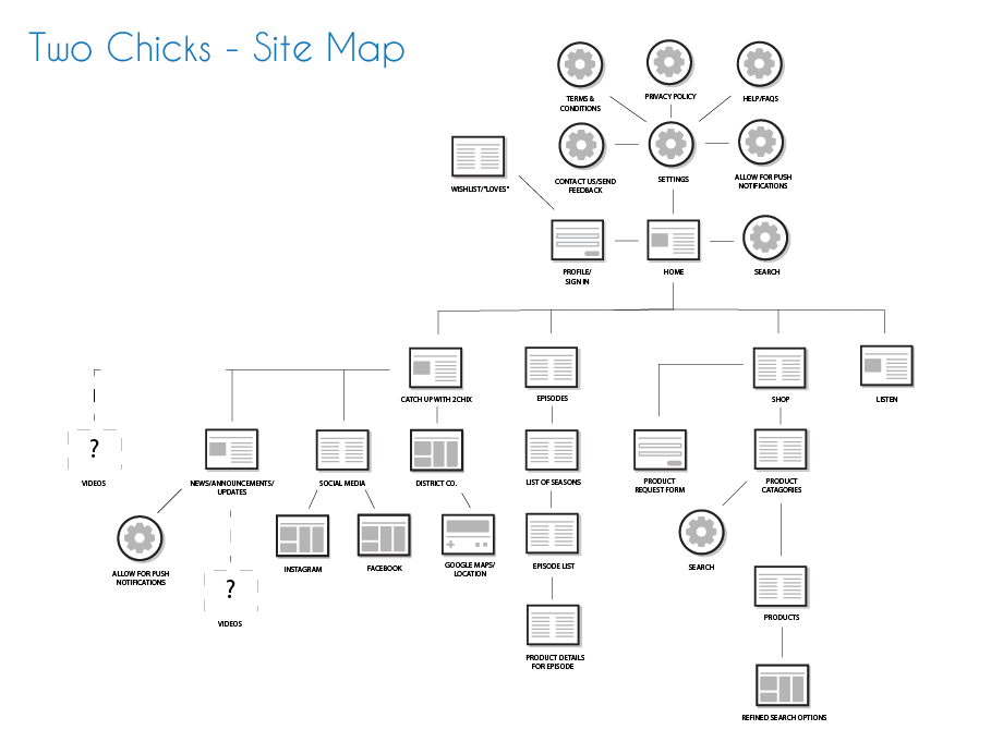
Deliverables: Sitemap, wireframes, mockups, interactive prototype, responsive mobile design, product replacement icon
Tools: Illustrator, XD, Photoshop
Timeline: First meeting - live app launch ~20 weeks
The Problem
The old version of the app lacked functionality, intuition, and a visually pleasing design. While pitching this app to brands and potential investors, they were on board with our business model until they saw the actual app… Which is not positive in the least.
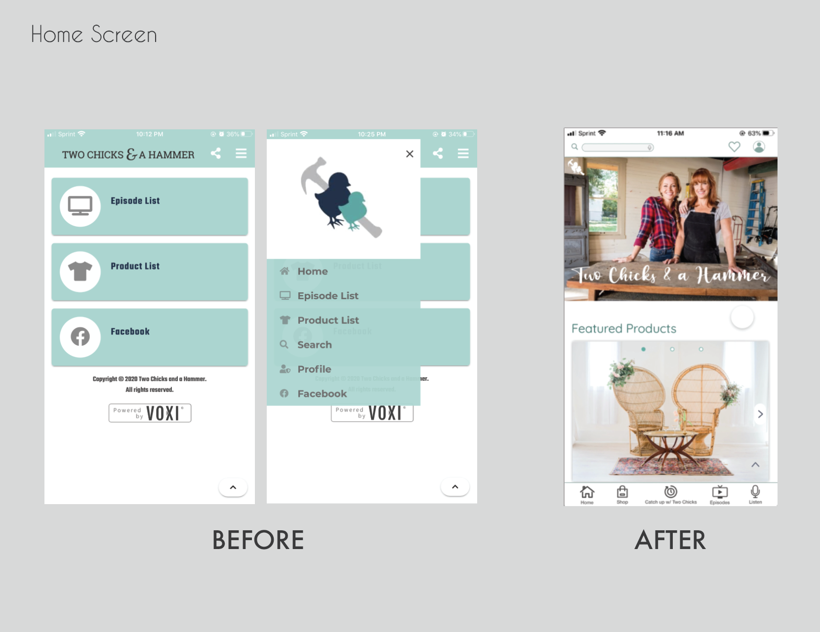
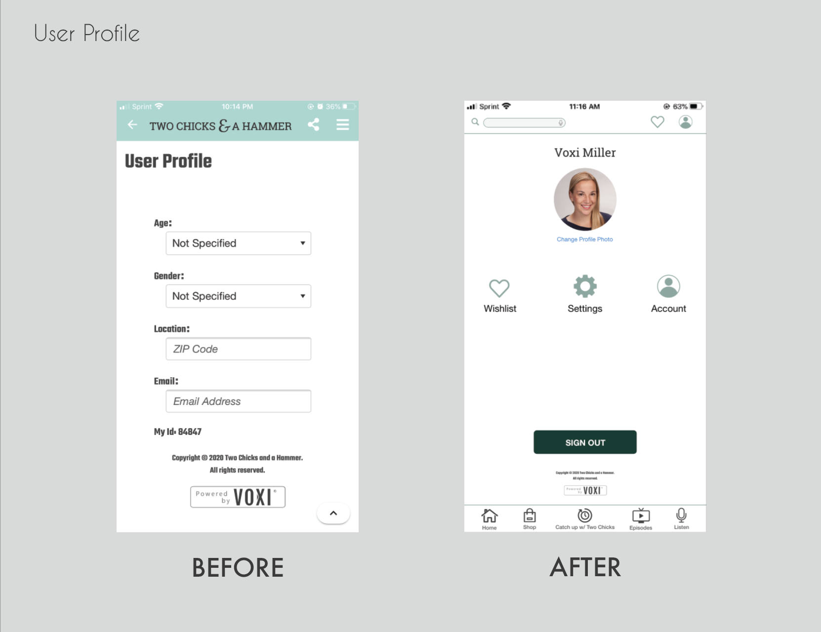
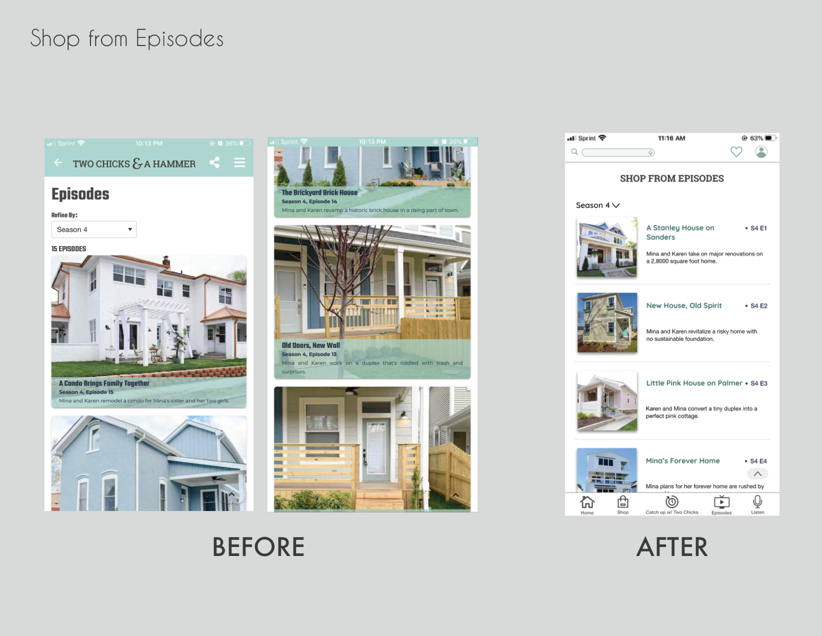
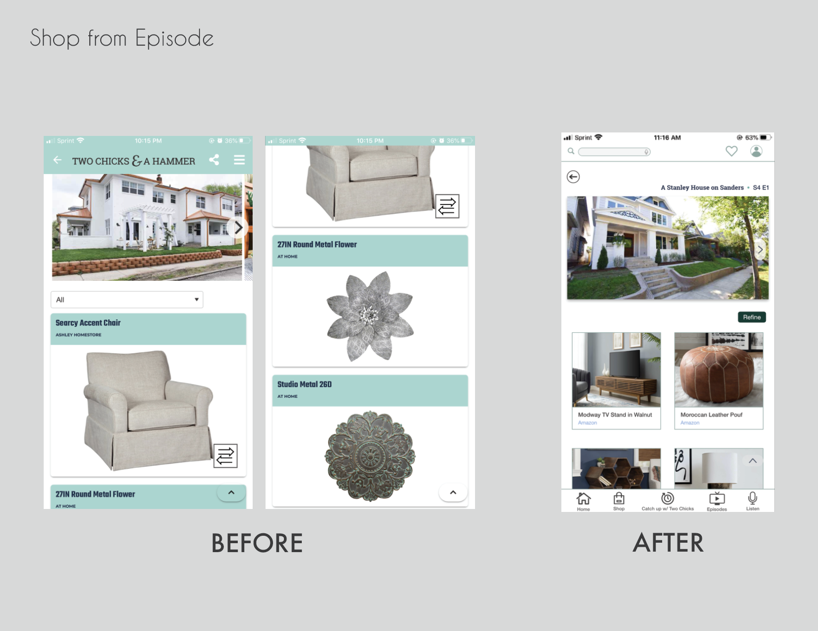
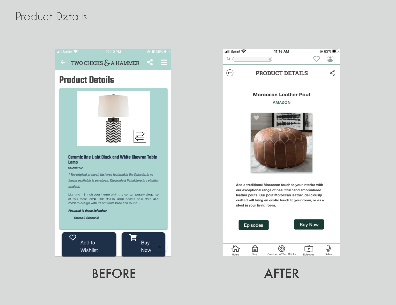
It was very frustrating, trying to navigate the app: buttons were not responsive, no indicators the page was loading, numerous clicks to get from point A to point B, immense scrolling because of the design layout, and the overall aesthetic wasn't easy on the eyes. Since there were many different brands and products on the app, the consistency between the product photo sizes varied, which made the app look messy and not well thought out.
The Solution
When I first joined the Voxi team, this was my biggest job: redesigning the entire app. To try to fix these problems, with the help of my CTO and junior developer, we made the app more intuitive, user-friendly, responsive, functional, and overall more aesthetically pleasing.
Approach
When I first jumped into this project, I was a tad overwhelmed, since there were several problems with the original app and I was the sole designer of the team. At first, I needed to make sense of everything from outside of the design perspective, like what the business needs were, the target audience, and user expectations.
Business Viability: We had weekly business meetings as a team to go over design and functionality expectations, as well as what was and wasn't possible for our developers to build out on Voxi's unique back-end platform.
Technical Feasibility: We ran into some roadblocks due to a few technical restraints on our platform, but once team expectations were flushed out, the app started to manifest and move forward.
User Desirability: This is the part that was somewhat difficult at the beginning of development. Since our company was a start-up with a small team, we didn't have the same resources to conduct broad user testing.
Because of this, I did extensive research on other competitor apps, Two Chicks and a Hammer's target audience, home renovation apps, and the top e-commerce apps, as well as Two Chicks and a Hammer's brand. Throughout development, we had our friends and family download our test flight app to examine app functionality and to see what they thought of the overall design.
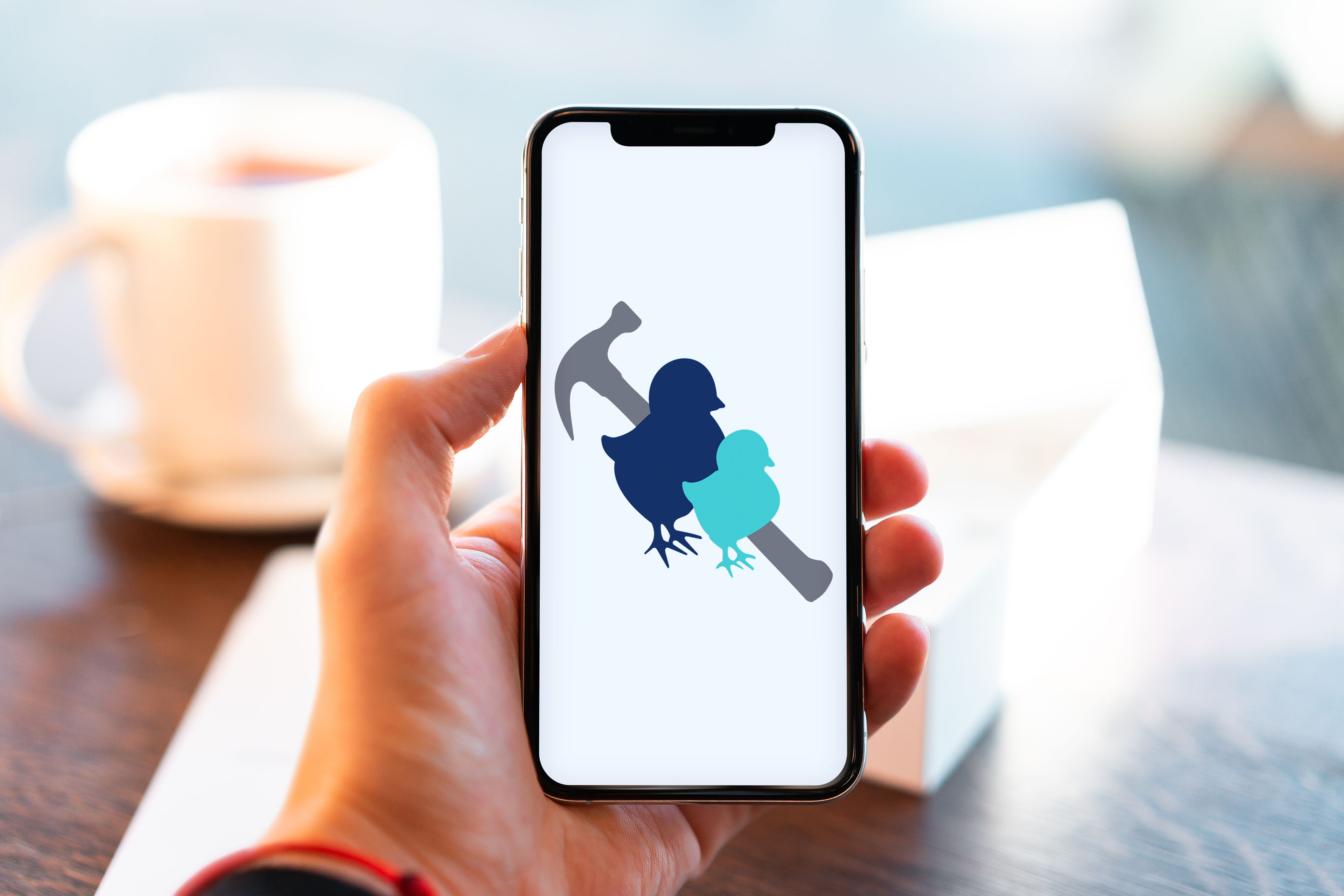
Product replacement icon
Lo-fi Wireframes
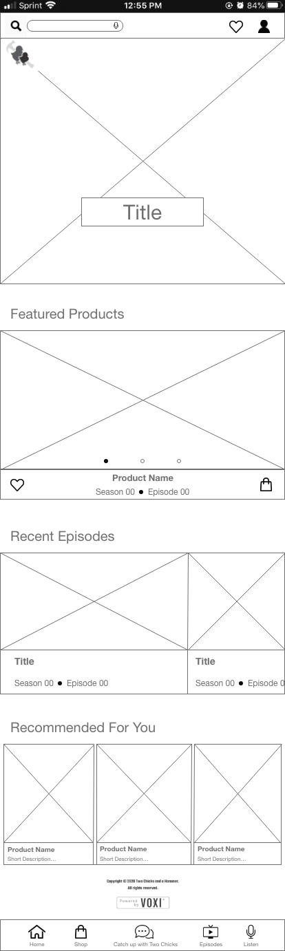
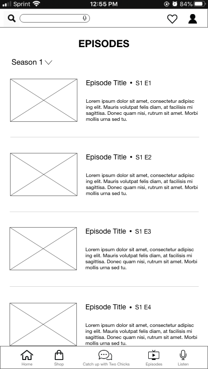
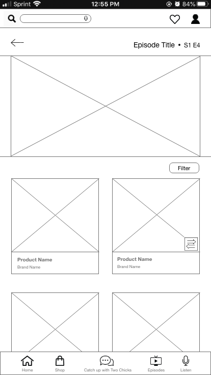
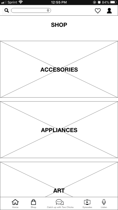
Hi-fi Wireframes
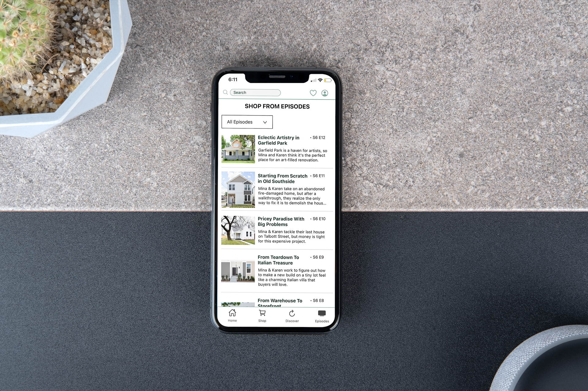
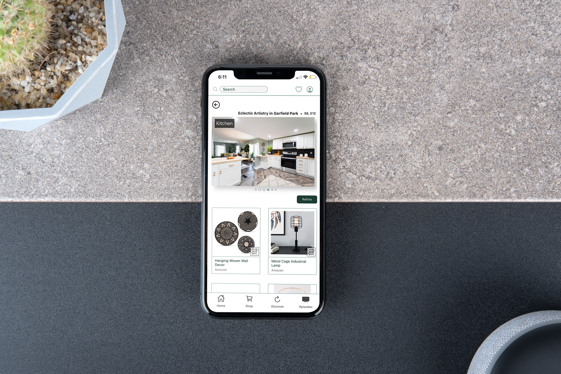
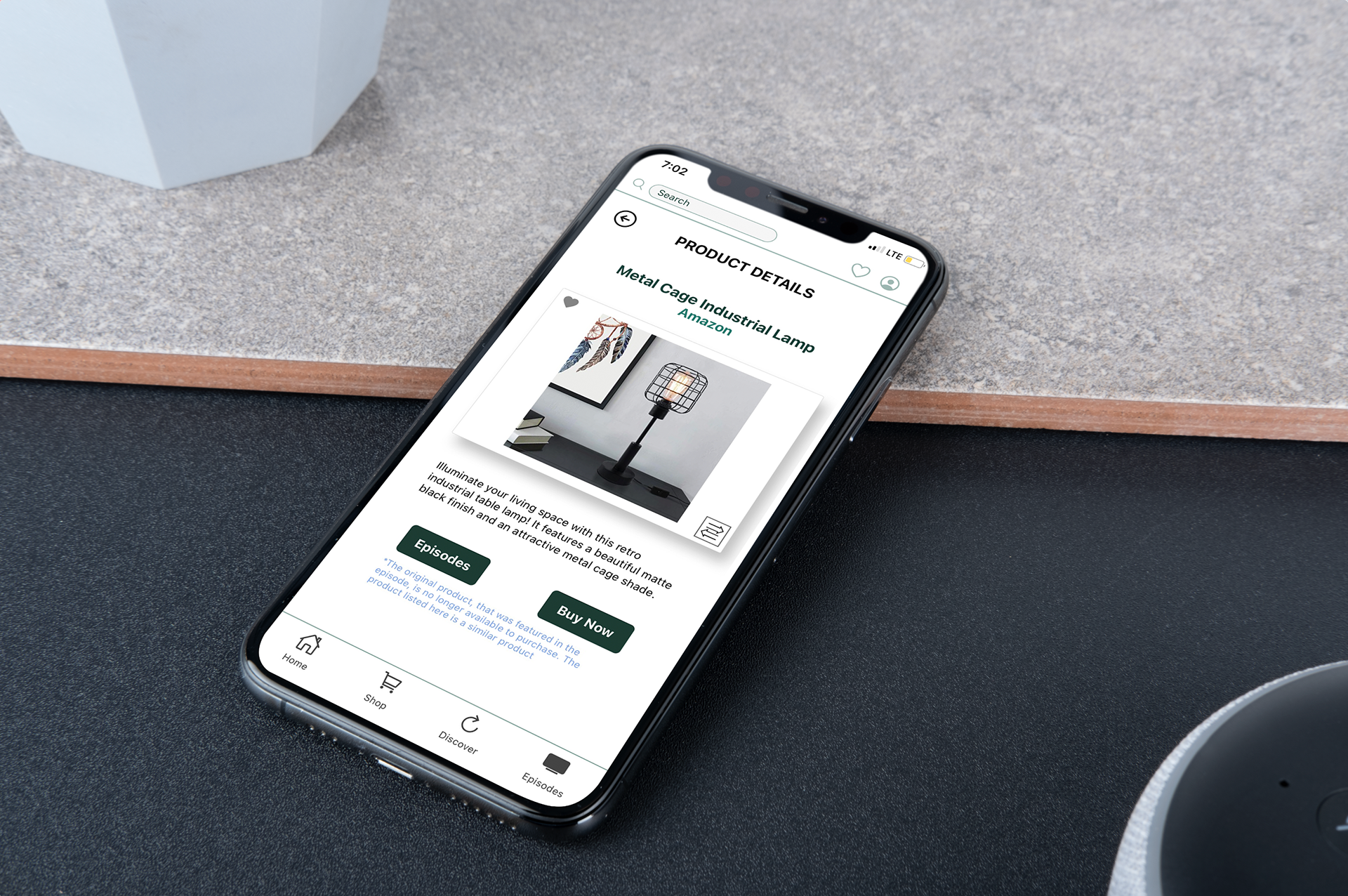
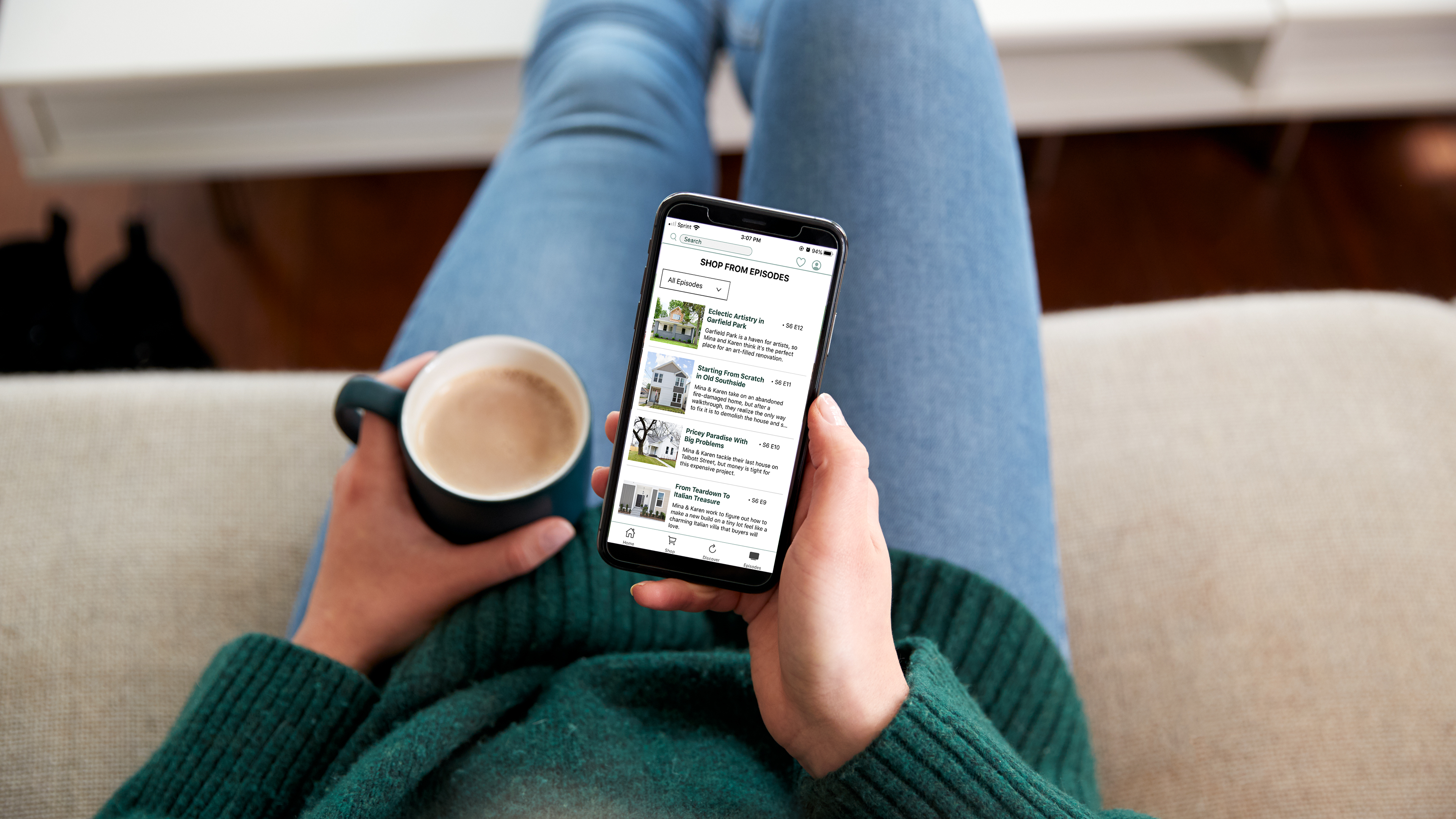
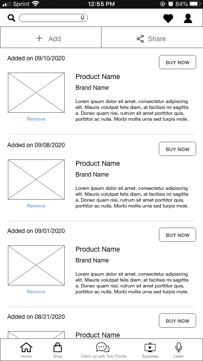
I took the wireframes above and used them as a guide for the hi-fi wireframes below to show the progression between the original app and the redesign. I stuck with an overall two-dimensional design to keep it clean and simple. I added drop shadows behind the individual products in "product details" and also the renovation room photos at the top of the "[shop from] episodes" tab to highlight them.
I use two shades of green throughout the app; dark green for the buttons, and light green accents, mainly used in the header and navigation. I chose to use these colors because they are the main colors on their "Two Chicks: District Co." storefront website. I wanted to bridge the gap between our app and their website to stay true to the Two Chicks and the Hammer's brand identity.
Other additions to further elevate the user experience:
•"Back to top" button
•Sticky header and navigation
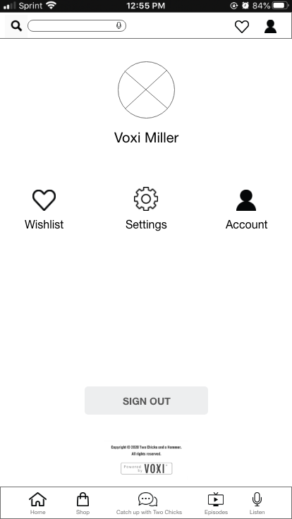
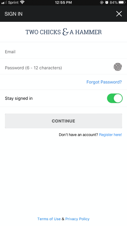
•Customizable user profile
•Scale down episodes, descriptions, and products to view more at once on the screen to reduce scrolling
•"Refine" button to categorize and filter products
Challenges
A big challenge for our team was getting everyone on the same page as to what our unique platform could and could not do in terms of functionality. It can sometimes be difficult to explain the limitations of the back-end development to those who are not as technologically advanced, as we all have our different strengths and specializations.
At the end of the day, we all had to trust and have confidence in our unique abilities to deliver this important project we worked hard to accomplish to meet the needs of our stakeholders and users.
What I Learned
1. It involves many different angles, and solving a user's problems; more than you may think.
2. Communication is extremely vital for all parties to successfully execute what the user wants, not what we may want.
3. It's important to search for solutions instead of getting hung up on problems that arise; use r resources to your advantage.
4. Design with intention, always!
Mobile App Video Demo